
In designing any interactive platform, particularly those that involve risk, probability, or financial engagement, the placement of warnings and alerts plays a critical role in shaping user behavior and enhancing situational awareness. Warning placement is not merely about compliance with regulations or adding cautionary notes; it is about strategically integrating these signals into the user journey so that they naturally capture attention without causing disruption or avoidance. The effectiveness of warnings depends on their visibility, contextual relevance, timing, and cognitive accessibility. Properly positioned alerts can act as behavioral checkpoints, guiding users to make informed decisions while preserving the flow of interaction.
One of the key principles in effective warning placement is understanding the user’s attention path. Human attention is limited and selective, meaning that warnings need to be placed where users are most likely to see and process them. For digital interfaces, this often corresponds to areas of high visual engagement, such as near primary action buttons, at decision points, or within the immediate field of interaction. In physical environments, warnings should align with natural lines of sight and be proportionate in scale to attract attention without overwhelming the senses. The core idea is to integrate warnings into the flow of interaction rather than presenting them as isolated or intrusive elements.
Timing is another critical factor. Warnings that appear too early may be ignored or forgotten by the time the user reaches the relevant action, while those that appear too late may not leave sufficient time for reflection or adjustment. Effective systems often employ anticipatory warnings, which give users a heads-up about potential risks before they commit to a decision, coupled with confirmatory prompts that appear immediately prior to executing a risky action. For example, in financial applications, a subtle notice about potential overdraft fees might appear during transaction input, while a more prominent confirmation appears before final submission. This layered approach reinforces awareness without creating cognitive fatigue.
Contextual relevance greatly enhances the salience of warnings. Users are more likely to heed alerts that are directly connected to their current task or environment. Irrelevant or generic warnings can dilute attention and breed habituation, where users begin to ignore all warnings over time. Systems that leverage dynamic, context-aware warnings—ones that adapt to the user’s choices, history, or real-time conditions—can maintain engagement and ensure that critical information is not lost in the noise. For example, a health and safety warning that appears only when certain thresholds are exceeded, or a gambling platform that highlights responsible gaming notices when users reach specific play patterns, demonstrates targeted, meaningful intervention.
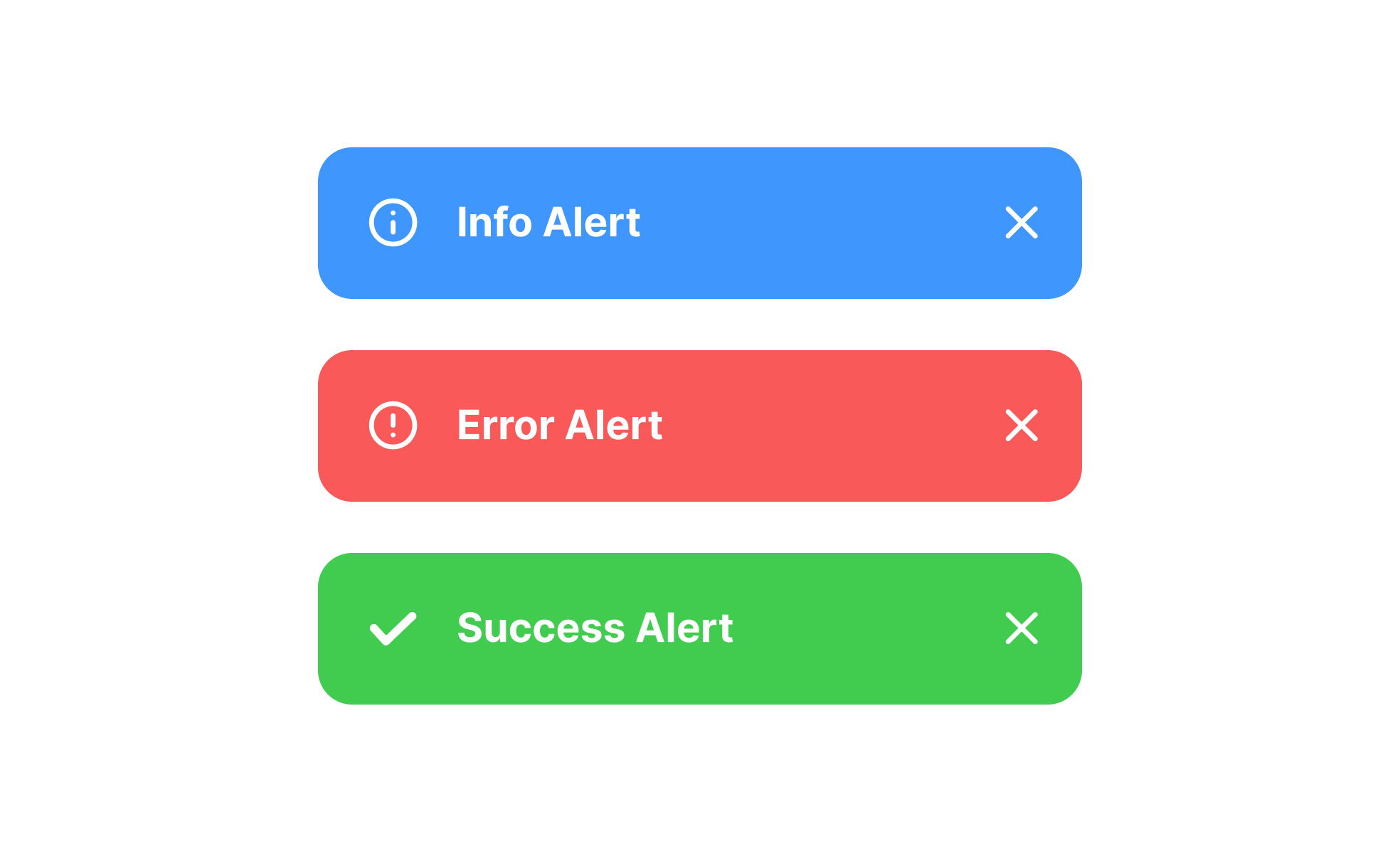
The design and format of warnings also influence their effectiveness. Visual hierarchy, color coding, iconography, and textual clarity all contribute to how quickly and accurately users interpret alerts. Combining visual cues with concise language and actionable instructions enhances comprehension. Overloading users with technical jargon or dense text reduces the likelihood of compliance and can inadvertently increase risk. Furthermore, multimodal warnings—such as pairing visual signals with auditory or haptic feedback—can reinforce awareness in environments where visual attention is divided or fleeting.
Behavioral psychology provides valuable insights into why users respond to warnings differently depending on placement and presentation. Research shows that people are more responsive to warnings that are proximate to the source of potential harm, framed in terms of immediate consequences, and perceived as credible. Warnings that are detached from actionable choices, hidden within menus, or formatted in ways that blend with other content are often ignored. Designers must consider these cognitive biases when determining the optimal location for alerts.
Integration with workflow is essential for ensuring that warnings enhance rather than hinder user experience. Alerts should not interrupt natural task flow unnecessarily, yet they must be difficult to overlook when the stakes are significant. A balance can be struck by designing tiered warning systems: subtle cues for low-risk conditions, and prominent, unavoidable alerts for high-risk scenarios. This gradation respects user autonomy while reinforcing attention when it is most needed. Additionally, repeated exposure to relevant warnings, reinforced across multiple touchpoints, can strengthen awareness and promote lasting behavioral change without causing annoyance.
Feedback and evaluation mechanisms play an important role in refining warning placement. Data on how users respond to alerts—whether they read, dismiss, or act upon them—can guide iterative adjustments. A/B testing different placements, designs, and triggers allows designers to identify configurations that maximize visibility and comprehension without creating fatigue or frustration. Importantly, user-centered testing ensures that warnings are interpretable by the intended audience and that cultural or situational factors are considered.
Digital systems often benefit from predictive and adaptive warning placement. By analyzing user behavior, historical patterns, and contextual data, platforms can anticipate situations that may warrant additional attention. For example, predictive warnings in online platforms can notify users of potentially excessive spending, unsecure actions, or procedural errors, adjusting in real time to the user’s activity. This proactive approach not only improves safety but also fosters trust, as users perceive the system as supportive and attentive to their needs.
Ultimately, effective warning placement is a synthesis of psychology, design, and strategic positioning. It requires careful consideration of visibility, timing, contextual relevance, clarity, workflow integration, and adaptive feedback. By placing warnings where they naturally intersect with user decision-making, designers can improve awareness, encourage responsible behavior, and mitigate potential harm without compromising engagement. When executed thoughtfully, warnings become an integral part of the user experience, serving as guiding signals that promote informed choices and reinforce trust in the system. Properly designed warnings do not merely caution; they educate, influence, and support users, helping them navigate complex environments with clarity and confidence.
The long-term benefit of optimized warning placement extends beyond immediate compliance. It fosters a culture of awareness, accountability, and informed decision-making. Users come to expect and respect well-positioned warnings, integrating them into habitual consideration of risks and outcomes. In high-stakes digital platforms, where split-second decisions can have significant consequences, such awareness is crucial. Strategic warning placement, therefore, is not simply a regulatory requirement—it is a foundational component of user-centered design, enhancing both safety and experience in a measurable, sustainable way.


Leave a Reply